

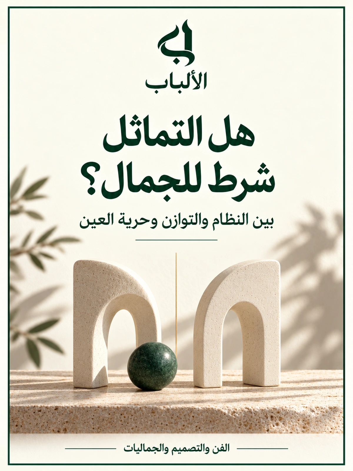
Two chairs before the window
In an imagined scene, a designer rearranges a small room before a friend visits. She puts matching chairs on either side of the window and centres a table with a vase between them. Looking from the doorway, she feels immediate ease: everything knows its place, and each side has a counterpart answering it. Then she moves one chair slightly towards the light and replaces the vase with a low bowl and a branch leaning to one side. The matching arrangement disappears, but the room loses none of its beauty. To her, it becomes less ceremonial and more ready for someone to sit in.
If she photographed both arrangements, a friend might choose the first for its clarity and calm, while she chose the second as closer to the life she wants. Neither need have miscalculated the distances. They also differ in what they expect from a place: reassuring regularity or a relationship allowing movement? These domestic details open a question broader than furniture: is symmetry a condition of beauty or one route towards it?
In its mirror form, symmetry means one side of a shape corresponds to the other as though reflected in a mirror. Not all regularity has this symmetry, and not all balance means matching halves. A small dark mass may balance a large light area without resembling it. An element may repeat regularly in a decorative band without the whole image having one mirror axis. Distinguishing these relationships protects us from using one word to explain everything that pleases the eye.
Opening questions
- Why do matching forms please us in some images and look artificial in others?
- Does noticing symmetry mean judging it beautiful?
- How can different elements achieve balance?
- When does an aesthetic rule help a designer, and when does it narrow their vision?
1. Symmetry is a clear relationship; beauty is a broader judgment
Geometric symmetry can be tested through a specific question: if we reflect half a shape around an axis, does it coincide with the other half? Beauty requires identifying what we are viewing, what we want from it, and in what sense we call it beautiful. We may mean harmony, craftsmanship, pleasure or the power to surprise. These meanings overlap without always coinciding. A painful image may be artistically powerful without comforting us, while a regular facade may be comfortable without leaving a lasting impression.
It is easy to see symmetry as a promise of order. When one arch faces another, their relationship does not leave us puzzled; we can describe it and anticipate its continuation. This is an analytical account of reading composition, not proof that every brain chooses every symmetrical image. The distinction matters because we sometimes move unnoticed from a reasonable observation to a universal law: if organisation is clear, it must be more beautiful; if it is more beautiful to me, it must be everyone’s standard.
In a 2019 study, Marco Bertamini and colleagues compared images from different categories with versions altered to become bilaterally symmetrical. Results showed a preference for symmetry in shapes and faces, but participants preferred original landscape images to perfectly symmetrical versions. The relationship between symmetry’s salience and preference also differed by context. These are particular images and a specific rating experiment, not a judgment on every landscape, painting or person. Original source and authors’ abstract.
“For landscapes, natural (no perfect symmetry) images were preferred.”
Original and source
For landscapes, natural (no perfect symmetry) images were preferred.
Marco Bertamini and colleagues
Experimental abstract; concerns the landscape stimuli used, not every landscape.
SourceThe finding helps refine the question. Instead of “Do people like symmetry?”, ask in what images, under which conditions, and through which measure of liking. Nor can it establish that irregular nature is always more beautiful or every mirror modification is bad. Those leaps reproduce the same problem in reverse. The useful point is that one geometric property alone cannot predict aesthetic experience across all domains.
Consider a hypothetical example independent of the experiment: designing a formal invitation and an image telling the story of a family outing. Precise centring may serve the invitation, emphasising the occasion and giving words clear space. In the outing image, a person at the frame’s edge may create the sense of going somewhere. Moving them to the centre merely to obey a rule might weaken the intended story. This is a possible design reading, not a guaranteed recipe or a finding taken from a particular study.
Describing a part also differs from describing a whole work. A symmetrical window may sit in an asymmetrical facade, and a regular frame may surround a free composition. Liking the result does not alone reveal which level determined our response. We can try isolating the part visually, then returning it to context, noticing how its relationship to its surroundings changes. This is a way of understanding, not dismantling that cancels the whole’s effect.
On an Arabic page especially, drawing a central axis and measuring distances on either side is insufficient. Words have a reading order, a heading has a beginning and end, and a line’s span is affected by word lengths. Centring may suit a short heading, while a long paragraph may need clear alignment to make following lines easy. This functional example does not judge every alignment’s beauty; it reminds us that design elements are not silent shapes with identical functions.
It also helps to distinguish beauty from fitness for purpose. Symmetrically arranged tools may look beautiful in an advertisement yet be awkward for repeated right- or left-handed use. An asymmetrical shelf may suit its contents yet require careful structural fixing. Safety does not derive from admiration, nor does function abolish pleasure. Good design examines relationships among these demands rather than appointing one to represent the rest.
2. The eye’s attention does not mean its approval
When we look at an image longer, we tend to explain it as liking. Yet we may pause because we are surprised, puzzled or trying to understand. Attention and preference should therefore be distinguished: one concerns directing or processing a gaze; the other concerns a judgment such as “I like this more.” They can coincide, but defining them as one attributes a feeling the viewer has not expressed.
Yi Huang and colleagues tested this distinction in children around four years old and adults in a 2018 study. They used explicit beauty ratings and measures of visual attention. Children looked longer at symmetrical patterns but did not show the same explicit aesthetic preference as adults in these tasks. This does not prove every child lacks a taste for symmetry, nor determine the contribution of learning or age by itself. It does invite us not to equate looking with liking. Study.
“We found a striking dissociation between these two measures in the children”
Original and source
We found a striking dissociation between these two measures in the children
Yi Huang and colleagues
The two measures are attention and explicit aesthetic evaluation in the children studied.
SourceThis distinction suggests a simple courtesy in discussing art. If a child studies a drawing for a long time, ask what caught their attention instead of deciding they loved it. If a friend chooses a form we do not understand, asking what attracts them is more precise than accusing them of failing to see order. We need not agree with every judgment, but can first learn what judgment was actually made.
Observation, naming and evaluation are three useful steps. I notice that two opposing masses resemble each other, name the relationship symmetry, then ask its effect in this image. The third step may find that it gives solemnity, or makes the scene more static than I want. This order prevents geometric description from quietly becoming praise. It also allows agreement on a property and disagreement on its effect.
A critic may err by asking language to settle what looking has not settled. We call a work “balanced,” then use the same word as proof of success, as though naming established the conclusion. Better to return to discussable details: where does the eye begin? Which element obscures another? Does empty space allow movement or leave an element isolated? Answers do not become wholly objective, but are clearer than a general judgment with no stated reason.
To reduce ambiguity, specify the comparison. Are we comparing two versions of one work, or works differing in subject, colour and size? In the latter case we may attribute liking to symmetry when our actual reason is a favourite colour or attachment to the scene. A visit need not become a laboratory; simply leave room for “I am not sure why.” That does not diminish the experience’s sincerity; it prevents a hurried explanation from taking it over.
This allows cultivation of taste without turning it into an exam. We can teach names for visual relationships, compare them and revise impressions. Knowledge does not oblige a predetermined preference. If a pupil ends the lesson repeating the teacher’s choice for fear of error, they have learned the required answer more than how to see. Vocabulary should increase their ability to describe and experiment, not reduce their right to pause over what they do not yet understand.
3. Balance allows difference to remain
In strict mirror symmetry, matching is part of the relationship itself. Visual balance, however, can be discussed as the distribution of forces we feel within a composition: size, colour, location, space and attention-catching meaning. These are not necessarily measured physical forces, but a way to describe visual experience. We should therefore avoid turning the metaphor of “weight” into a final equation that reduces every image.
Imagine a page with a short dark heading on the right and a large pale image on the left. Neither is a copy of the other, yet their presence may answer each other without either swallowing the other. Making them identical could erase the difference between their functions. In this editorial example, balance does not ask different things to disguise their differences; it asks how elements can coexist in one space.
In a study by Ronald Hübner published in 2025, results differed between rating ready-made images and arranging movable elements. In the rating task, participants preferred positional symmetry to balance and balance to proximity. Proximity was used frequently in the arrangement task, alongside a tendency towards positional symmetry. Here positional symmetry means corresponding locations even when element sizes differ, rather than strict mirror matching. These tasks used simple elements and limited samples, not every kind of art. Study.
“assessment methods substantially impact the preferred composition rules”
Original and source
assessment methods substantially impact the preferred composition rules
Ronald Hübner
Conclusion comparing ratings of ready-made images with arranging elements.
SourceWe draw a practical question rather than a new law from this: am I judging the design while making part of it or after seeing it complete? A designer may focus on aligning two elements and forget their relationship with the rest of the page. A viewer may reject a thumbnail and then discover a detail on enlargement that changes the reading. Changing viewing distance and method, and testing work where it will be used, can help without promising to solve every problem.
Purpose also matters when designing for a group. One person may suggest centring everything for calm; another may want a button or information highlighted so users find it quickly. A clear overall order can coexist with intentionally different levels of prominence. Giving every element equal weight is not visual fairness when their responsibilities differ. Still, we should be able to explain the difference to users and test whether it guides or confuses them.
Design changes with size, too. An arrangement coherent on a wide screen may have small, scattered words on a phone. Preserving the same image is not then an absolute virtue; elements may need moving or reordering so relationships remain understandable. The symmetry we want to preserve is a means within reading, not a pledge forbidding repair of a difficult display. Success includes what the reader can do, beyond the order a designer can exhibit.
Empty space has a role that needs no matching counterpart to fill it. In a hypothetical composition of someone looking left, the space before them may create anticipation. Filling it with a matching element might clarify geometry while answering an anticipation that belonged to its meaning. This is an interpretive possibility; another viewer may read it differently. Its value is reminding us that “empty space” is not necessarily unfinished work needing compensation.
When a rule becomes an authority
We can accept symmetry’s usefulness without making it a moral rank. Orderly taste is not necessarily more virtuous, and a liking for free composition is no proof of courage or depth. Attaching these qualities to taste shifts discussion from images to people’s identities. Someone may then choose what suits the group they want to belong to even when their actual experience differs.
Generalising about bodies is more dangerous than generalising about posters. Our subject is composition and image evaluation; study findings do not entitle us to reduce a person to the symmetry of their features. Dignity is not a prize awarded by the eye and needs no aesthetic ranking to exist. We can study visual preferences while refusing to turn them into standards of human worth or eligibility for love and respect. This ethical distinction places research within its scope without denying it.
4. Expertise widens possibilities without guaranteeing a reversal of taste
We might expect art students to prefer asymmetry because their eyes are accustomed to complex compositions. But this is another ready-made image needing testing. In a 2018 study by Hannah Weichselbaum, Helmut Leder and Ulrich Ansorge, greater art expertise was associated with higher explicit beauty ratings for asymmetrical patterns, while an overall preference for symmetrical patterns remained. The same expertise effect did not appear in the implicit association test. This comparison does not prove training caused change, nor is the implicit test a direct reading of hidden taste. Study.
“with higher art expertise, the ratings for the beauty of asymmetrical patterns significantly increased”
Original and source
with higher art expertise, the ratings for the beauty of asymmetrical patterns significantly increased
Hannah Weichselbaum and colleagues
Association in explicit ratings while an overall symmetry preference remained; not causal proof.
SourceA possible educational implication is not to teach viewers hatred of order as a route to expertise. Knowledge can add questions to looking: how was the relationship made? What happens when an element moves? Does repetition serve rhythm or obscure differences? These widen the field of judgment. We may still prefer the symmetrical work afterwards, but for an understood reason, while seeing what the alternative achieves.
“Intentional” can tempt us to exempt every decision from criticism. An artist says a deviation was intentional and thinks discussion is over. Intention explains a decision’s beginning but alone cannot judge its effect. A viewer can acknowledge the designer wanted movement, then explain why they felt distracted. This disagreement is material for review, not an accusation about motives. Where a work addresses a particular audience, understanding its reading is part of respecting that audience.
Conversely, we should not require every work to reveal one purpose immediately. Its effect may depend on a possible relationship or an open question. No general phrase settles the difference between productive ambiguity and unresolved confusion; it deserves repeated looking and comparison. Some works may remain far from our taste without being declared failures, and we can criticise a famous work without pretending admiration to gain cultural status.
Freedom from a rule does not make its opposite a better rule. Not every departure from an axis is successful movement, and not every difference signals originality. A leaning element may simply be an unresolved decision, while meticulous regularity may be exactly what the work needs. Designers should explain a modification’s function to themselves and then see it in the image, rather than merely call it bold or unconventional.
A serious objection: does advocating difference beautify disorder?
This deserves more than reassurance. In a 2013 study by Andreas Gartus and Helmut Leder, slightly breaking symmetry in abstract patterns reduced liking compared with fully symmetrical patterns despite increased complexity. This does not make every asymmetrical composition less beautiful, but blocks the easy claim that adding a small irregularity necessarily increases attraction. Here we rely on the authors’ abstract available from the publisher, without claiming to have reviewed methodological details absent from the page. Source.
“patterns with slightly broken symmetries were significantly less liked than fully symmetric ones”
Original and source
patterns with slightly broken symmetries were significantly less liked than fully symmetric ones
Andreas Gartus and Helmut Leder
Abstract finding in abstract patterns; not generalised to all art.
SourceWe are therefore defending choices suited to a work and the right to question a general rule, not irregularity for its own sake. A successful symmetrical painting need not be broken to prove its modernity. A coherent composition of different elements need not be levelled to pass a matching test. Whoever proposes change should still explain what it adds: clarity, movement, a new relationship or a previously absent meaning.
The objection also reveals limits to “there is no arguing about taste.” Evidence, detail and function can be discussed while room for disagreement remains. We cannot oblige every eye to the same conclusion, but can ask whether our explanation rests on what is actually in the work. Aesthetic freedom still needs attention, and a rule still needs testing for suitability. Between arbitrary demands in the name of order and those in the name of freedom lies ample room for review.
In the light of the Quran and Islamic wisdom
Allah says: TRANSLATION OF THE MEANING · COMPLETE VERSE 16:6There is beauty for you in them when you bring them home to rest and when you take them out to graze[1].Translation notes: [1] Their bringing back is mentioned before their setting off to pasture because that is when their udders and waists are full and thus more pleasing to the beholder.Rowwad Translation Center · QuranEnc · v1.0.20 [An-Nahl, 16:6]. The verse occurs in a context of reminding people of the blessing and benefits of livestock. Al-Saadi explains their beauty at rest and in movement, and the adornment people find in them. This is a documented contextual meaning, not a lesson in symmetry’s laws or endorsement of a modern psychology experiment. Verse and Al-Saadi’s commentary.
As editorial reflection, the context draws attention to beauty within everyday life, in the movement of creatures people benefit from and know. We need not extract beauty from its relationships to see it or confine it to objects displayed solely for evaluation. We may glimpse beauty in organising useful work, caring for a living thing or crafting a tool well. These are examples for reflecting on experience’s breadth, not additions to or restrictions on the verse’s interpretation.
Allah also says: TRANSLATION OF THE MEANING · COMPLETE VERSE 67:3Who created seven heavens one above another; you will not see any imperfection[1] in the creation of the Most Compassionate. Look again; can you see any flaw?Translation notes: [1] All parts of the universe are well connected and in perfect harmony and coordination. There is no indiscipline, disorder and discordance in the universe, and nothing is disjointed and out of proportion in the creation of Allah. As for birth defects, genetic mutations and other things that we see in the world are part of this great creation, for perfection cannot be noticed except if the opposite is seen, also as a test for humans.Rowwad Translation Center · QuranEnc · v1.0.20 [Al-Mulk, 67:3]. Al-Saadi explains the relevant term here through defect and deficiency, and clarifies the invitation to look again and take heed. We should not equate that term in this context with any geometric difference between a painting’s sides or derive a judgment that asymmetry is ugly. Text and commentary.
Distinguishing craftsmanship from matching is essential to our reflection. A maker may skilfully produce something whose parts differ because their functions differ, or repeat identical parts and connect or use them badly. This is a human observation about making, not a comparison of Allah’s creation with our manufactures. The educational quality we invoke is serious looking: returning to understand something rather than settling for a passing impression or an inherited, unexamined word.
The eye retains ethical responsibility in its treatment of people and things. If pursuit of beauty becomes contempt for what fails our standard, we have moved from composition into justice and compassion. If admiration disguises wastefulness or boasting, an attractive appearance alone cannot justify the act. This is an editorial ethical position, attributed neither to a cognitive study nor to verses as an experimental result they did not address.
A practical experiment: change the relationship before changing the judgment
Begin with a simple space you can control: a page, a shelf, or two photographs of the same objects. Specify one aim before arranging: clarity, calm or a sense of movement. Do not let “beauty” conceal that purpose. A visually successful attempt may fail your need, or you may reject a suitable composition by comparing it with an example serving an entirely different aim.
Make one version as symmetrical as possible, then another changing only one relationship: an element’s position, size or surrounding space. Keep the rest constant where possible. This is not a scientific experiment sufficient to derive a law, but an exercise in knowing what you actually changed. If colours, sizes and positions all change, you may like the alternative without knowing which decision contributed.
Look from far away and close up, at the size in which the design will be used. Record description before preference: “The heading comes before the image,” “The small element catches my eye because of its colour,” or “I do not know where to begin.” Then write your judgment and reason. What you called disorder may prove to be crowding in one area, with adjusting space between two elements more useful than converting the whole composition into matching halves.
If you wish, show both versions to someone without saying which you consider superior. Ask what they noticed first, which best serves the stated purpose, then which they personally prefer. The three answers may differ, usefully preventing function, attention and liking from being reduced to one vote. Do not call this representative audience testing or make one person’s view a final judgment on your taste.
Finally, do not turn the exercise into a project to repair every corner of your home or every saved image. Some things stay because they belong to us, not because their visual distribution is optimal. An unbalanced photograph may hold a memory no more precise composition can replace. Recognising that value does not change symmetry’s definition, but clarifies that our relationships with images extend beyond aesthetics.
Conclusion: order that opens the eye
Symmetry appears neither a sole condition nor a sufficient guarantee of beauty. It is a strong visual relationship that can serve clarity and harmony, but its effect relates to image type, context, task and viewer. Balance does not always require one side to copy the other. Nor does asymmetry deserve admiration simply for breaking a rule; like every design decision, it must find its place in the work.
Return to the small room. The designer might restore both chairs to their first positions for a formal occasion and move one when she wants to sit near the light. She has neither abandoned order in the second case nor betrayed freedom in the first. She chooses a relationship suited to the room’s life. A wider taste may begin beautifully by adding to “Did the form obey the rule?” another question: “What did this relationship allow me to see?”
Questions that stay with us
- Do I describe a visual relationship before judging it, or use description as ready-made praise?
- What work have I loved despite its lack of mirror symmetry?
- When designing, do I test the form in its actual context of use?
- What can I learn from a different taste without surrendering my judgment?